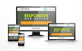
REASONS YOUR WEBSITE NEEDS TO BE MORE RESPONSIVE

When it comes to having a website designed for sales, there are articles by the hundreds. Mostly because brand owners and marketers recognize the need for an impressive website and the impact it can have on your sales.
Websites are created to serve the main purpose of giving an interested audience what they want, when they want it, and how they want it. Keeping this philosophy in mind, we researched to find what are the most fundamental practices brands should advocate for when looking to create a new online user experience or improve their site’s current responsiveness.
Responsive Layouts Matter.
The average page visit lasts less than a minute which makes the general layout, look and feel of your website the utmost important.
Images & Video Need To Be Adaptive.
87% of online marketers use video marketing with more than 500 million hours of video watched every day on YouTube. Video marketing has made its stamp on every marketer’s roadmap and ensuring videos and images are responsive to your online storefront, is definitely a critical component of any successful user experience.
Mobile Is Where It’s At.
In 2016, mobile usage surpassed desktop usage and anyone paying attention to how users use their phone to guide their research and general purchase intent needs, wouldn’t find this as such a surprise. According to Pew Research, roughly one-in-five Americans adults are “smartphone-only” internet users. That translates to a huge chunk of the population that spends the majority of their time on their phones. For an effective online shopping or even educative experience, the site’s layout, functionality, and general user impression should be optimized for mobile first.
User Experiences Are Becoming More Dynamic When It Comes To Multimedia.
Responsive web design is defined as “the approach that suggests that design and development should respond to the user’s behavior and environment based on screen size, platform, and orientation. Regardless of the types of multimedia, you’re using, the user doesn’t care about the work going into the backend, they just want seamless functionality that get them what they need, in the shortest time possible.
Typography Is Not What It Used To Be.
Fluid layouts are common topic of discussion for developers but the concept of fluid typography is more new school when it comes to web design. When working with designers, its common to get a Sketch or Photoshop layout options to look at mock options for the final user experience. Using tools like viewpoint units, they add a layer of flexibility in that they allow your test to resize with the functionality of the layout. Remember, while it is debatable whether responsive website, it does advocate for a simpler user experience across devices, regardless of engaging through an app, mobile or desktop.